the very berry lab
it started with a group of horticulture researchers.
A refreshed brand identity and website were on the menu for The Very Berry Lab, a group of horticulturists at North Carolina State University.
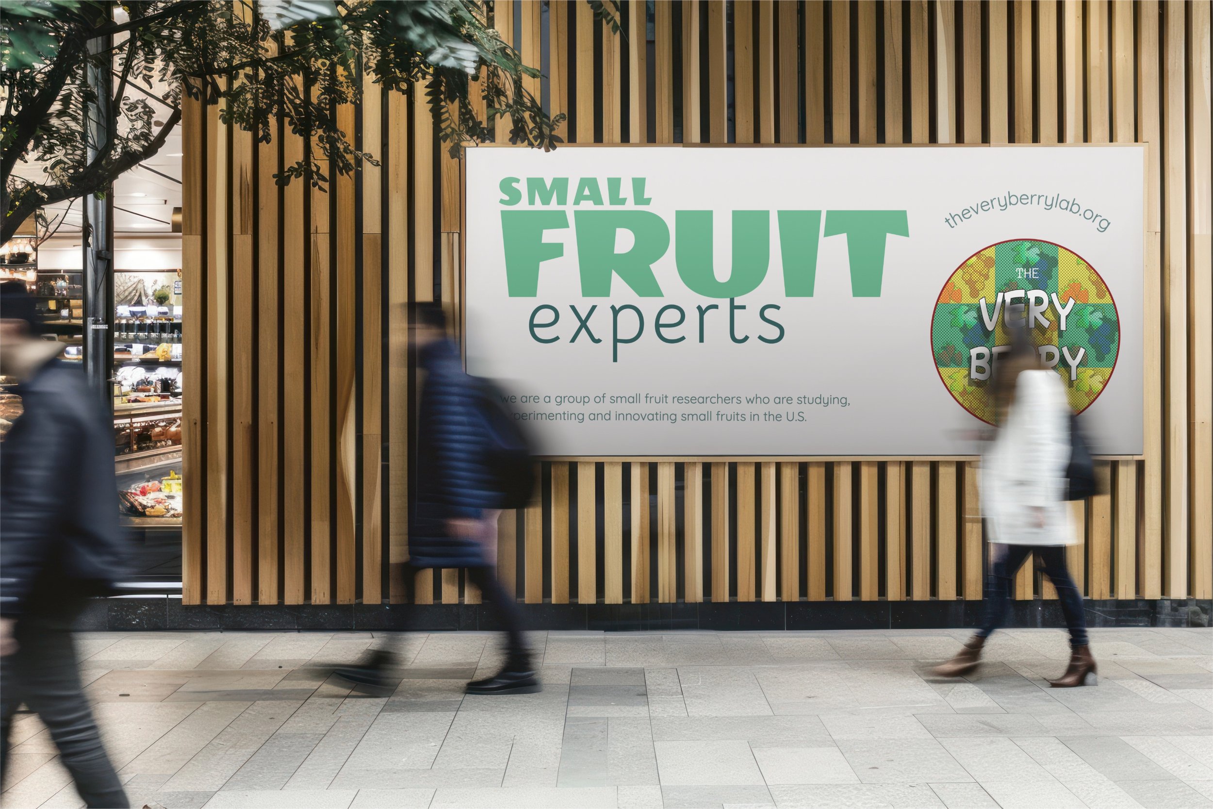
the small fruit experts


client
The Very Berry Lab
services
Visual Identity
Website
Visual identity
Process
The Very Berry Lab had existing visual structure. There was already a logo and although it was made using a generator of some type it was very clean and cute. Since I didn’t need to reinvent the wheel here, I opted to keep some elements from the previous iteration.
Starting from that point, I expanded upon ideas that blended science and small fruits. This included developing a simple yet sophisticated primary-centered color palette, finding typefaces that would compliment what we were trying to accomplish, creating logos that served our two unique niches, and crafting mockups to better visualize our concepts.
Deliverables
Color Palette
Typography
Logo Suite
Illustrations
Mockups
Color Palette
Typography

Dongle

Mochiy Pop One
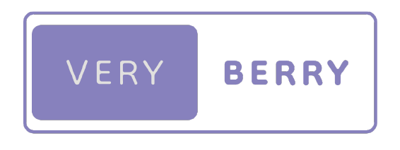
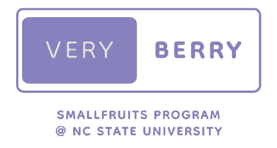
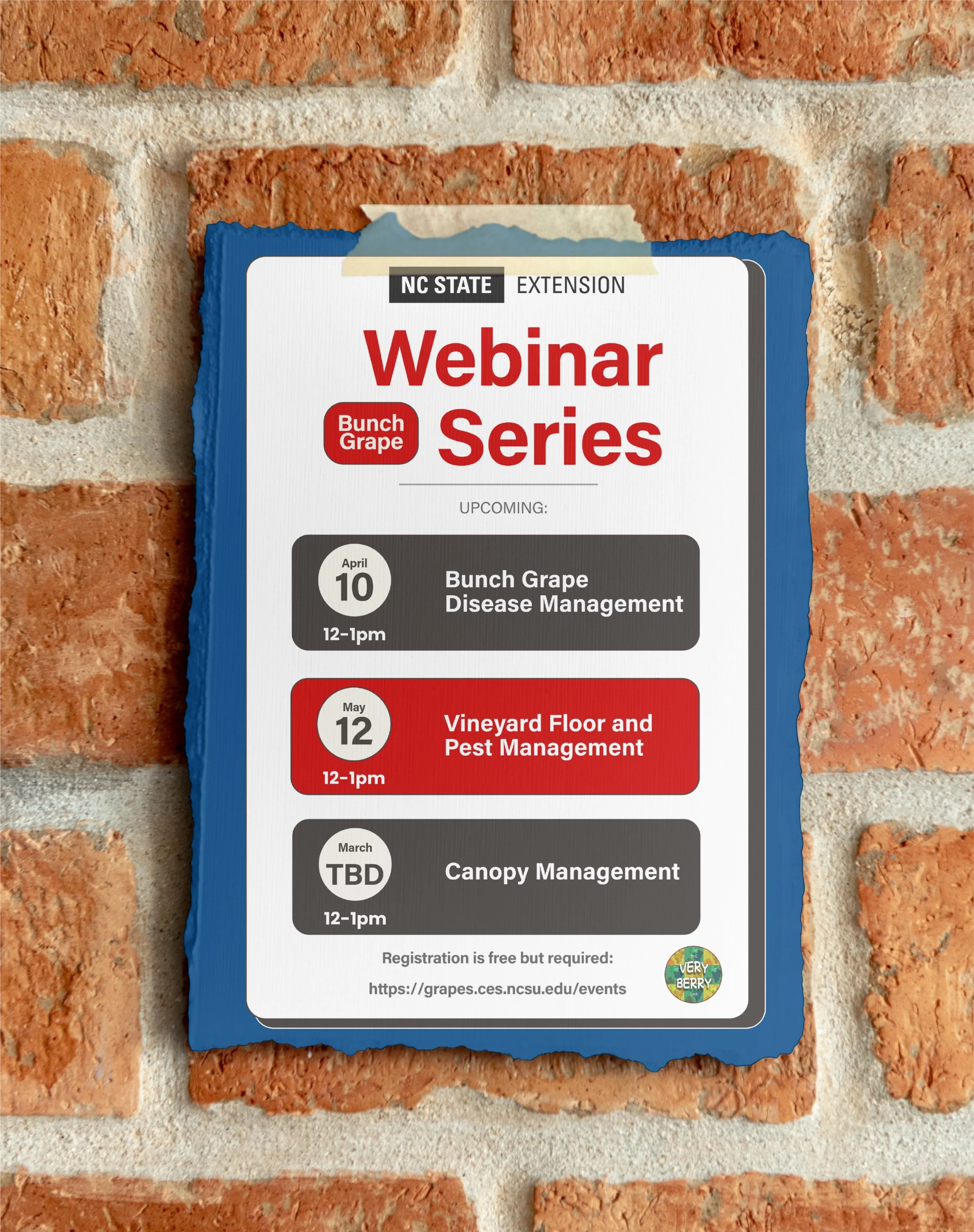
Logo Suite


Illustrations


Mockups
Design Rational
The mission of a business guides my design. After all, the visual system should serve the work, not distract from it.
For The Very Berry Lab, that mission sounds lofty at first glance: “Provide science-based solutions to growers, industry, and academia; implement crop production and genetic technology to improve tomorrow's food security; and develop future leaders in horticulture and viticulture.” But really, their work is grounded in something simple: helping local strawberry and grape growers work smarter, produce better crops, and stay profitable. That means better fruit for all of us—and stronger businesses for the people growing it.
They weren’t just publishing research. They were building trust across very different audiences: growers, academic peers, and everyday consumers.
So instead of squeezing everyone into a one-size-fits-all brand, I created two visual identities:
• A clean, institutional logo system for academic and industry settings
• A friendlier, illustrated version for outreach and public-facing materials
From there, I built a cohesive but flexible visual language—color, type, iconography, and illustration style—that stretches across both.
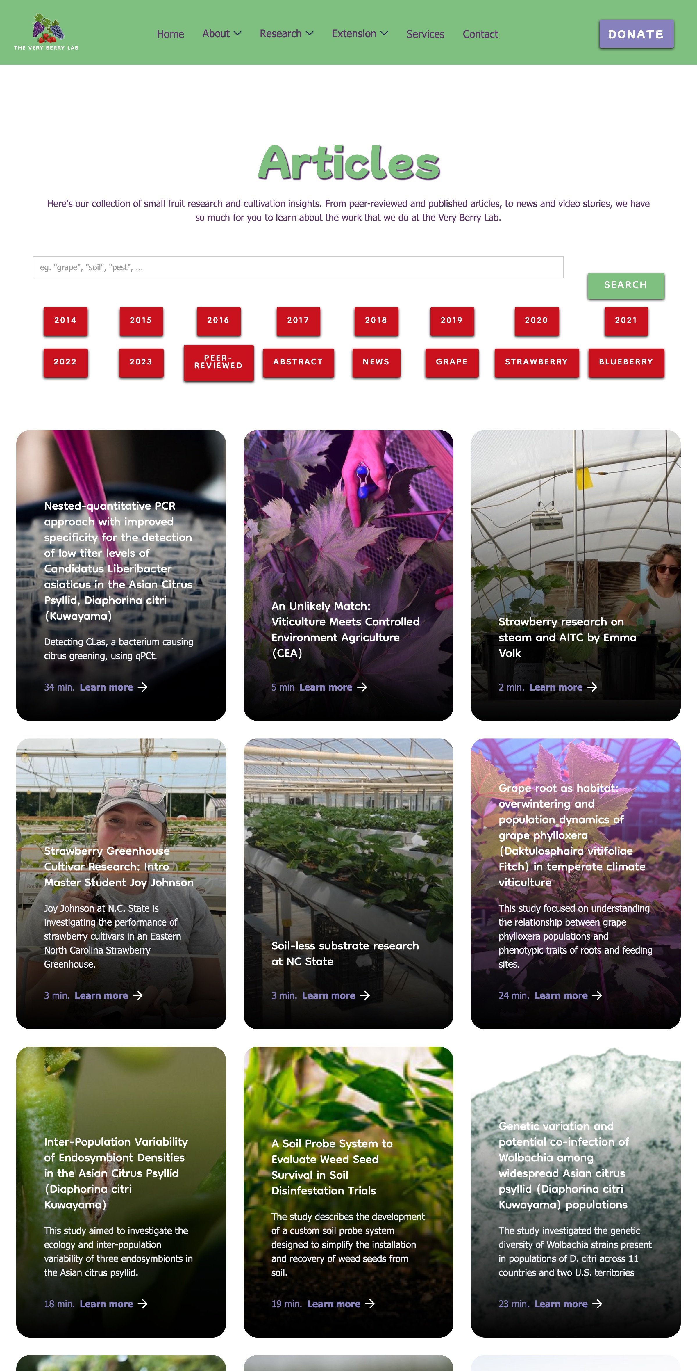
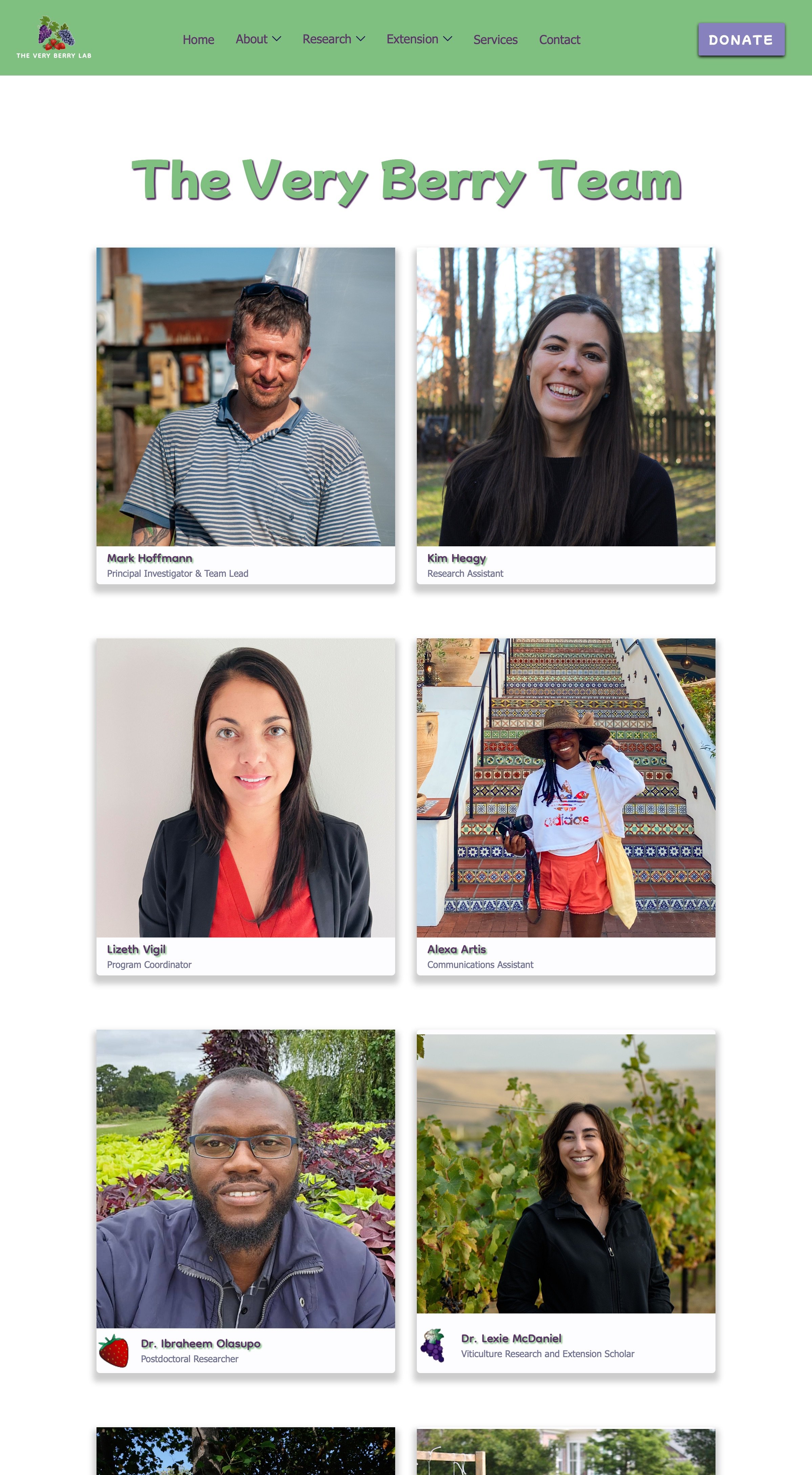
Website
Process
While the visuals pulled people in, the website’s job was to inform. About the lab, the team, the projects, the mission—you get it.
We started with the deliverables: a full migration off WordPress and onto something easier to maintain. After some research, Webflow stood out as the best fit—visual-first, clean, and future-proof for a small team.
Next up: securing a better domain. We landed on theveryberrylab.org, clean and straightforward, and grabbed it through GoDaddy.
Then came the layout. After rounds of wireframes, we landed on a simple structure that could support current content while making room for growth.
Finally, we built it out. Some pages came over cleanly. Others needed a full redesign. The result? A site that’s easy to navigate, easy to update, and built to support their work—not slow it down.
Deliverables
New platform
New domain name
10+ pages
Tech stack
Built in Webflow
Responsive design (desktop, tablet, mobile)
CMS for easy updates
Domain hosted via GoDaddy